Optimizing your Twitter profile picture
How to get noticed. Or how to annoy people. We’ll find out.
The bar closed years ago. The t-shirt, though still tucked away at the bottom of my dresser, is more cobweb than clothing, only able to survive the most gentle of dryer cycles. The hair is mostly missing, buzzed off in the back and retreating from its post in the front. The Instagram filter, one of the originals that makes every shot look like an oversaturated late-night Polaroid, is gone, replaced by more delicate options worthy of candle-selling influencers. And the photographer moved on to a new state, a new career, and a new boyfriend.
But the picture remains, proudly grinning at the top of my Twitter timeline and alongside every tweet, the headshot for my most prominent public profile on the world wide web, my avatar to the internet.
The problem with taking down an old picture, however, is you have to replace it with something else—something that’s simultaneously flattering, creative, and captures you as you were and are and want to be, all while looking casually chill about the whole thing. After ten years of trying and failing to find exactly that photo, this time, I set out to steal someone else’s. I scrolled through Twitter looking for ideas; nothing spoke to me. I scrolled on. I paused at a tweet by Nate Silver: “Critics are calling Folklore Taylor Swift’s best album. It also begins a new chapter for her image.” Bad take,1 but also, weird take for Nate Silver? Then I realized it—I wasn’t looking at a Nate Silver tweet, but one from Vox.com. I had mistaken the blaring yellow Vox logo for the blaring yellow book cover that used to be Silver’s avatar.2
On one hand, it was an annoying bait and switch. On the other hand, neat trick. Every yellow dot subconsciously reminded me of Silver’s ad—promoting, appropriately enough, his book called The Signal and the Noise. In the middle of a sea of brown and beige heads, yellow stood out like a data scientist on a TV panel of seasoned political anchors.
The episode made me wonder if I could pull off the same maneuver. As someone with a face for radio (and a voice for print) (and a brain for TV), why not abandon the traditional headshot in favor of a blistering flash of color and alarm, with no purpose other than to engineer a Pavlovian glance at my otherwise inane tweets?
And if I'm going to do that—if I’m going to replace my face with a searing eyesore just to pick up a few likes—I'm going all in. Yellow is a good option, but is it the best? The only thing worse than a sellout is a tentative one.
Which color, then, should I pick?
The loudest person in the crowd
Put simply, my goal was to choose a profile picture that stands out among other pictures as much as possible. Though I suspect something lurid or obscene would score me some views (if not a ban), I set two parameters. First, to give myself a fighting chance of figuring this out, I only need to find a single prominent color, which I could use as the background in a more traditional picture. Second, this color should be, among all the colors on the color wheel, the one that contrasts the most with the average profile picture on Twitter. 3
My first step was to gather a random sample of 10,000 tweets and their associated profile pictures over the course of a day in April.

At this point, I came to the same realization I had when I played around with how brands use color to represent themselves on Instagram: Color science is complicated, and I don’t understand most of it. Figuring out which single color stands out the most in this rowdy mosaic requires a level of sophistication well beyond what my TV brain is capable of. So I simplified it—I squinted.
Well, sort of. Using the Python module Color Thief, I extracted the dominant color from each picture, reducing my grid of 10,000 faces into one of 10,000 oversized pixels, each representing the most important color in its corresponding profile photo.
I then plotted these colors on a circular histogram, where each slice represents a sliver of the HSL color wheel. The higher the slice, the more prevalent that segment is among the 10,000 profile pictures. Each slice is then shaded to match the average color of all the pictures that fell into that segment.

Given that most pictures are probably faces, it’s not surprising that the most common colors are various shades of brown. For people looking for good camouflage on Twitter, you can’t do much better than #987359.
For those of us looking for a siren, we have a couple options. One option is to pick the least represented color on the histogram, which is a close race between two ugly shades of green.
But this method has a problem, beyond requiring me to make the most searchable picture of myself on the internet that of a poorly lit sewer. While these colors are uncommon, they don’t necessarily stand out. If I’m going to represent myself with a pixelated portrait of the Swamp Thing, I don’t just want people to think it’s weird; I want them to notice.
A better approach might be to invert each picture’s colors, turning our mosaic into an Andy Warhol of the everyday person. This spins the previous histogram 180 degrees, and makes the most common color—which, given the inversion, is theoretically one that would stand out against actual profile pictures—a pleasing shade of blue.
This color, caught somewhere between Goldman Sachs and Oral-B, definitely looks nicer. But it introduces another problem. Twitter’s profile pictures exist on opposite sides of the color wheel, primarily as shades of brown and blue. While pastel blues are the most common inverted colors, they’re the second most common unaltered colors. In my effort to be different, all I did was join the second most popular clique.
Fortunately, we have one more option. The color wheel, counterintuitively, has corners. Its extremes are represented by eight points: the six colors that appear every 60 degrees, plus black and white. Using the RGB color model, these are the colors that are produced by choosing different combinations of red, green, and blue values at the maximum or minimum of their respective scales.
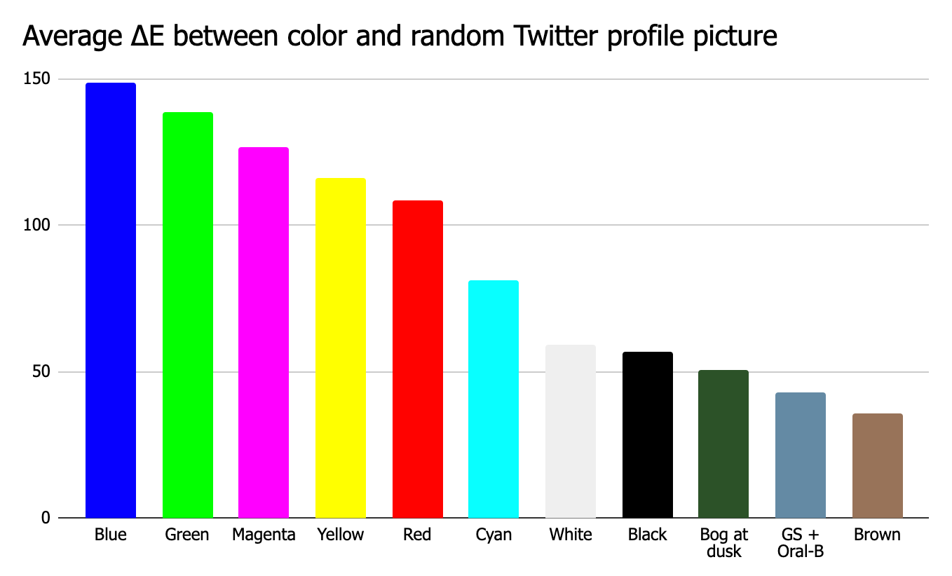
In color science, the visual distinction between colors is measured by delta E, or ΔE. Because the eight colors shown above are on the extremes of the color wheel, no color can be further away (i.e., can have a higher average ΔE) from our sample of profile pictures than one of these eight. In other words, of all the colors on the visible spectrum, the best choice for my profile has to be among these eight.
The improvement is dramatic. When these colors are mixed in with real profile pictures, they stand out just as obnoxiously as they were meant to. The grid below is divided into eleven columns, each mixed with one of the colors above. The first eight columns blend in the eight “edge” colors (starting with black and ending with white). Compare these columns with the barely visible colors in the last three columns, which substitute some pictures with the earlier shades of green, blue, and brown.
Before declaring blue the winner, it’s worth considering one more detail. Profile pictures aren’t just fighting with other pictures for attention; they also need to stand out from the app in which they’re embedded.
Twitter offers three app background colors: white, black, and “dim” (it’s a dark blue). Though blue contrasts the most against the white background, green is more prominent on the black and dark blue backgrounds. Between blue and green, the average difference across three backgrounds are nearly identical.
On the whole, blue is probably the best choice. It’s slightly more distinctive than green compared to the average profile picture, and it stands out the most against the default white background. But green is a very close second, dark backgrounds seem to be more common among frequent Twitter users, and replacing my profile picture with a solitary blue emblem could be interpreted in a very different way. Plus, I like green, and I’m not above weighing aesthetic considerations over empirical ones.
So green it is—scorching, unapologetic, and crackling new. Time to go get some likes.4
It’s 1989, and it’s not close.
He’s since changed his picture has to the field that whirs and beeps at you at the eye doctor.
To create the perfectly optimal picture for myself, I should gather the profile pictures of all the people my followers follow, which are the pictures I’m currently competing with for attention. Twitter’s API makes doing this inordinately difficult. Because my own feed is probably partially representative of the feeds my followers see, I also ran this analysis against the pictures of the people I follow. This approach produced a nearly identical conclusion as using a random sample of pictures, implying not only that personalization is unnecessary, but also that there's some sort of central limit theorem of profile pictures, where any sufficiently large sample will always have a similar tonal composition. I also adjusted both analyses so that people who had larger followings got more weight; the results were again the same.
But probably, blocks.


